Attendible
Attendible is a local social calendar that helps users find fun things to do around them. With a small team, we were able to grow our user base to over 6,000 users, 300 of which were local businesses that were using our platform to add events and share them with the community.
MY ROLE
Product Development | Product Design | User Research| Market Research| Prototyping | Branding
I was responsible for defining the user experience on both web and mobile, and for all design related decisions. My work consisted of brainstorming & collaborating with the developers to ship great features that resonated with our users. I was also responsible for conducting usability studies and researching competitors in the market.
I was responsible for defining the user experience on both web and mobile, and for all design related decisions. My work consisted of brainstorming & collaborating with the developers to ship great features that resonated with our users. I was also responsible for conducting usability studies and researching competitors in the market.
GATHERING DATA AND UNDERSTANDING WHAT THE USER WANTS
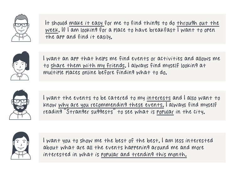
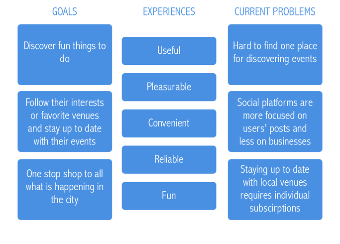
First persona: We started by trying to understand our target user and their use-case scenarios:
- As a user I would like to be able to see events that are happening around me.
- As a user I would like to be able to save events that I want to attend for later.
- As a user I would like to see what are the most popular events around me.
- As a user I would like to follow my favorite venues or interests and stay up to date with latest events.
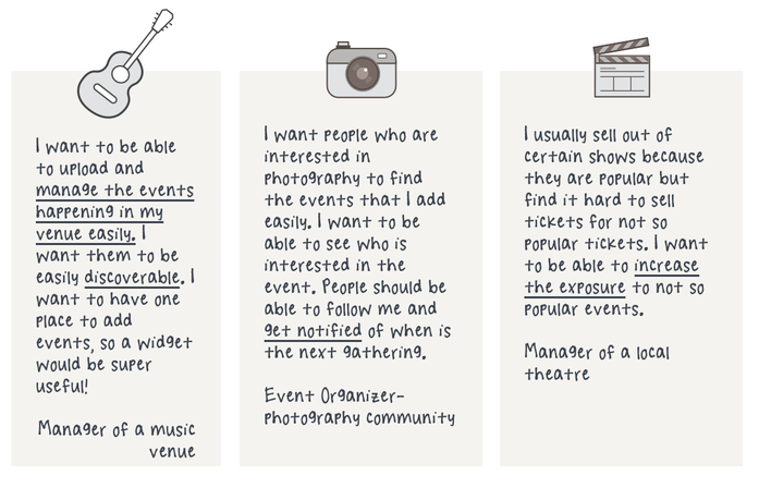
Second persona (Venue manager | community event organizer | Restaurant manager| Marketing manager)
We sat down with several managers of local venues in Seattle and took their feedback on how they share their events with the community and what can be done to enhance this experience. Some of the things that were important to them were:
We sat down with several managers of local venues in Seattle and took their feedback on how they share their events with the community and what can be done to enhance this experience. Some of the things that were important to them were:
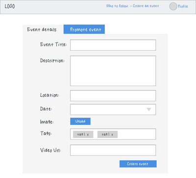
- Easily manage events on the web, it's a lot of work to add events on their website and requires technical help sometimes
- Discoverability by the users, it's hard to spread the word about events on social media platforms
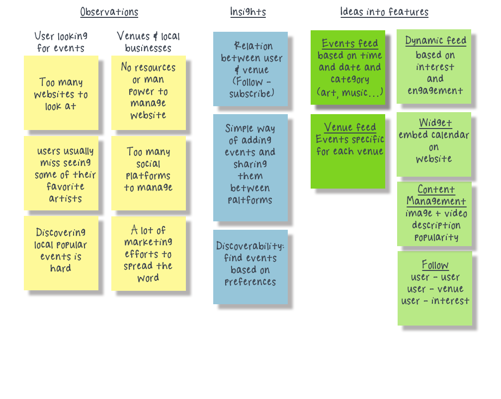
OBSERVATIONS & INSIGHTS
Based on the feedback from potential users and local businesses, along with market research and competitor's analysis, we were able to get some insights that would help us start laying the first blocks for the product:
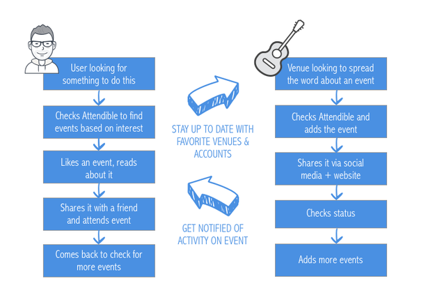
USER JOURNEY
- User looking for an event
- Venue trying to spread the word about an event
CHALLENGES
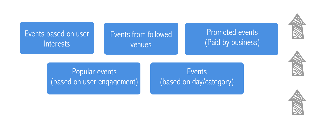
How are we populating events on the page? How can we make it an exciting experience for the user and the businesses at the same time?
Are all the users seeing the same calendar of events? Is it personal for each user and if so how are we achieving this?
APPROACH
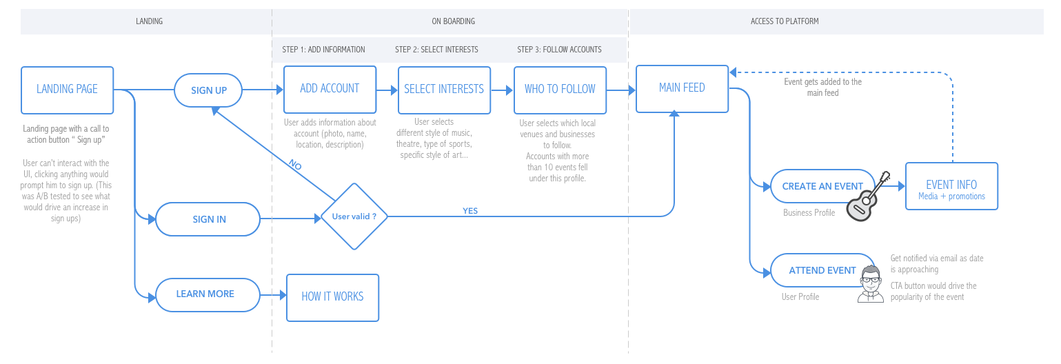
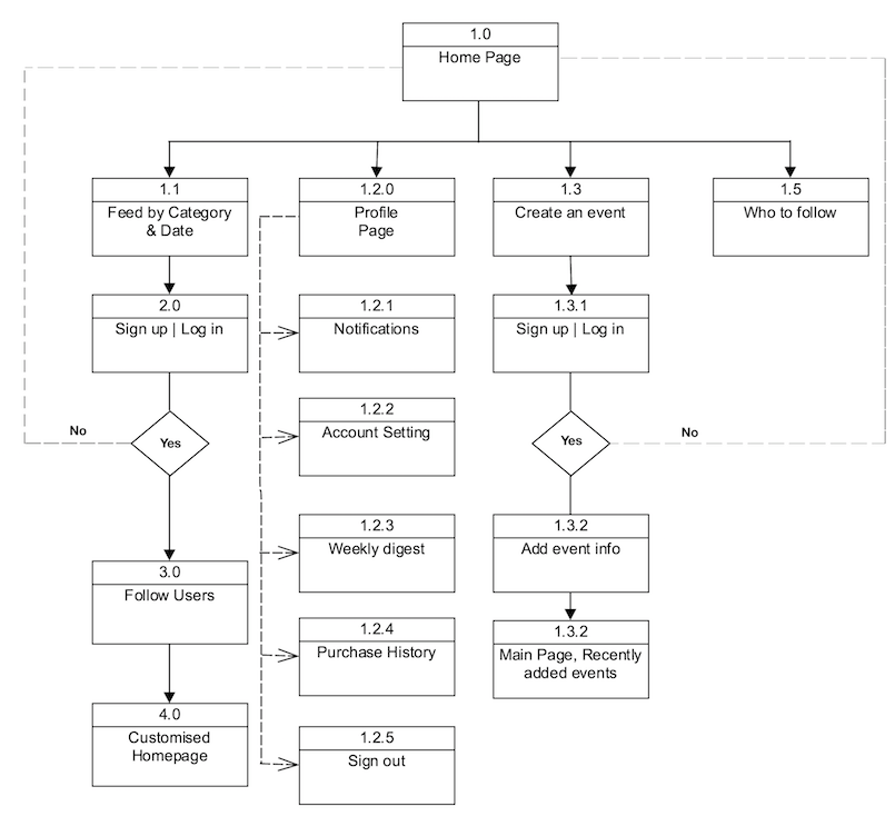
USER FLOW AND WIREFRAMING
Some of the feature that we wanted to include in V1:
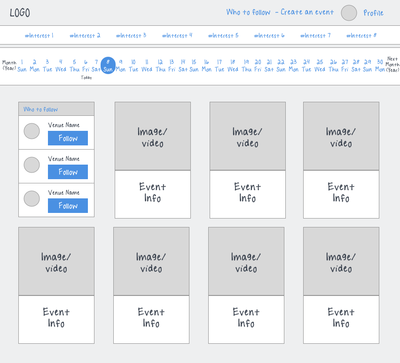
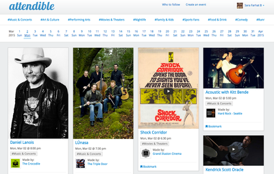
- Calendar that allowed the user to jump to a specific date
- General Categories that helped filter events (Food & drinks, Art & culture, Theatre, Sports...)
- An event feed that was customized depending on user interests, followed venues and popularity
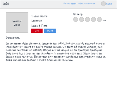
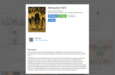
- Event page that allowed the user to read more about an event
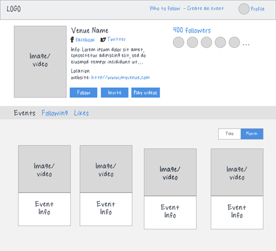
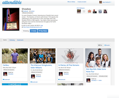
- A rich profile page that allowed local businesses to showcase events and information about them
DESIGN
USABILITY AND POST DESIGN CHALLENGES
1.How to excite users to engage with content?
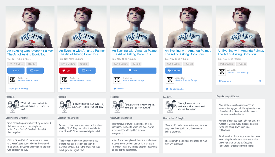
We knew that the core of our product is that the popularity of the events was driven by the users. Our CTA button for that needed to be spot on!
We launched our first version of the product with the assumption that "Attend" will do the trick and "Share" will increase the number of sign ups. Over the course of a year, we created at least 4 different versions of our CTA button and conducted different usability testings and kept an eye on the below metrics:
We launched our first version of the product with the assumption that "Attend" will do the trick and "Share" will increase the number of sign ups. Over the course of a year, we created at least 4 different versions of our CTA button and conducted different usability testings and kept an eye on the below metrics:
- Sign ups (How many new users did we get each month?)
- Engagement ( How many times was the the user clicking on "Attend"?)
- Visits (How many visitors were we getting each month?)
2.Designing the right landing page
We had three designs for the landing page, it was important for us to build something that would increase traction and push the user to sign up.
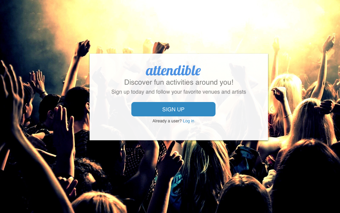
Landing page 1: Didn't offer any content, instead there was an exciting image and a call to "SIGN UP"
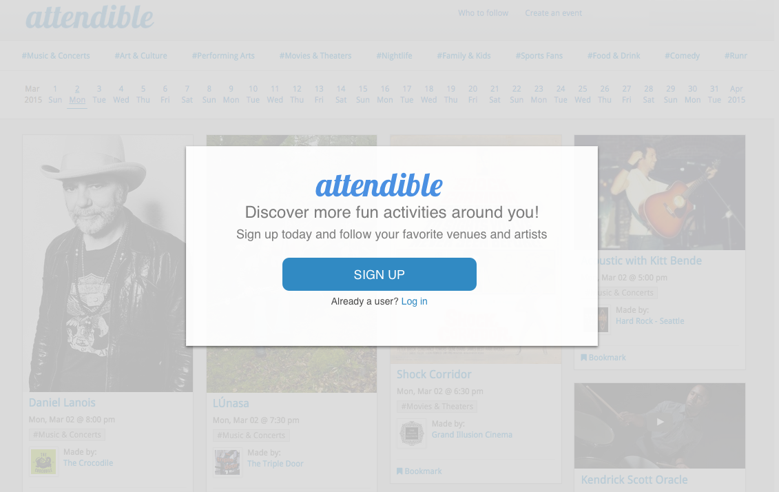
Landing page 2: A window pop up that would display once the user tried clicking anything on the UI
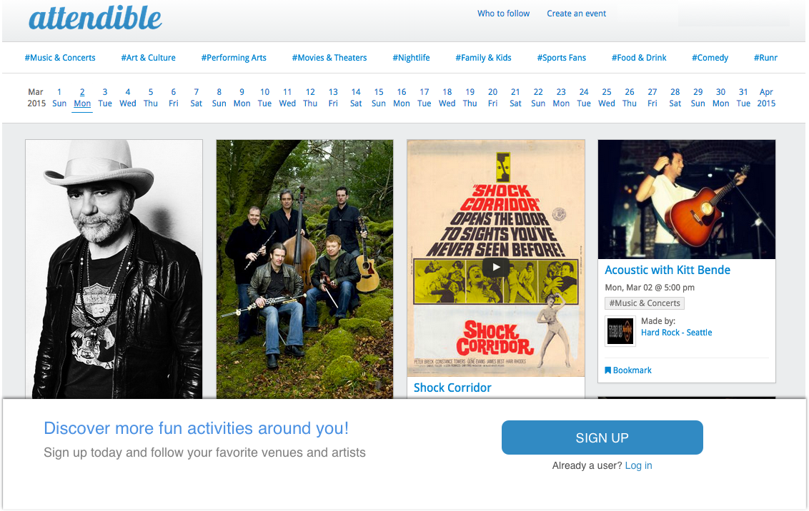
Landing page 3: A lower fixed pane that would appear after user scrolled a the page or after clicking something on the page
After A/B testing the landing pages, we noticed that the lower pane was the one with the highest number of sign ups.
DESIGNING FOR MOBILE WAS A WHOLE NEW EXPERIENCE!
Having shipped the website before the mobile app had its own advantages and disadvantages. One of the advantages is we understood better what our users wanted. However we faced many challenges while designing for the small screen:
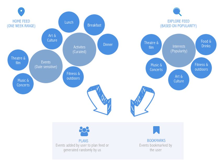
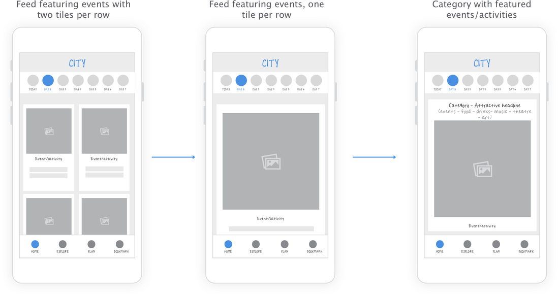
- The web was focused on showing all events happening on the specific day under a specific interest, usually ranging between 10 - 40 events, on the phone scrolling through all of these events would be cumbersome. We noticed, through testing with prototypes, that after 4 scrolls users would stop!
- Through page analytics we noticed that users were only looking at events within a week's range.
- Users wanted to see more than just events. Most of them said they would go to an event 1 or 2 times a week but the frequency of visiting a restaurant, bar or art gallery was much higher. (Insights from a survey conducted with some of our users)
- Based on surveys 70% of users said that when going to an event/or doing an activity they always want to invite friends to join them. Most of them said that they usually create a group message thread with the friends they want to invite.
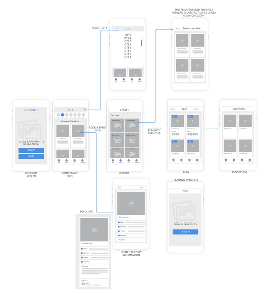
USER FLOW ON MOBILE APP
| app_flow.png |
CHALLENGE: ADAPTING WEB EXPERIENC TO MOBILE EXPERIENCE
DESIGN
Featured on Geekwire as App of the Week!

