FormotusFormotus is a SAAS platform that allows companies to build forms in order to collect data and integrate it with their systems.
Some of the services Formotus provides:
|
MY ROLE
Product design | Usability testing | Branding | Interaction design
- Redesigning the management portal
- Designing a form creator to help the company branch out from dependency on InfoPath
- Creating a unified style library
- Conducting usability testing to improve user experience
THE MANAGEMENT PORTAL
ORGANIZING THE STRUCTURE OF MANAGEMENT PORTAL
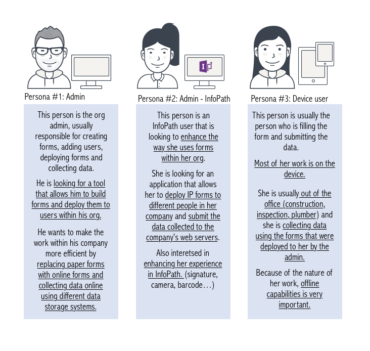
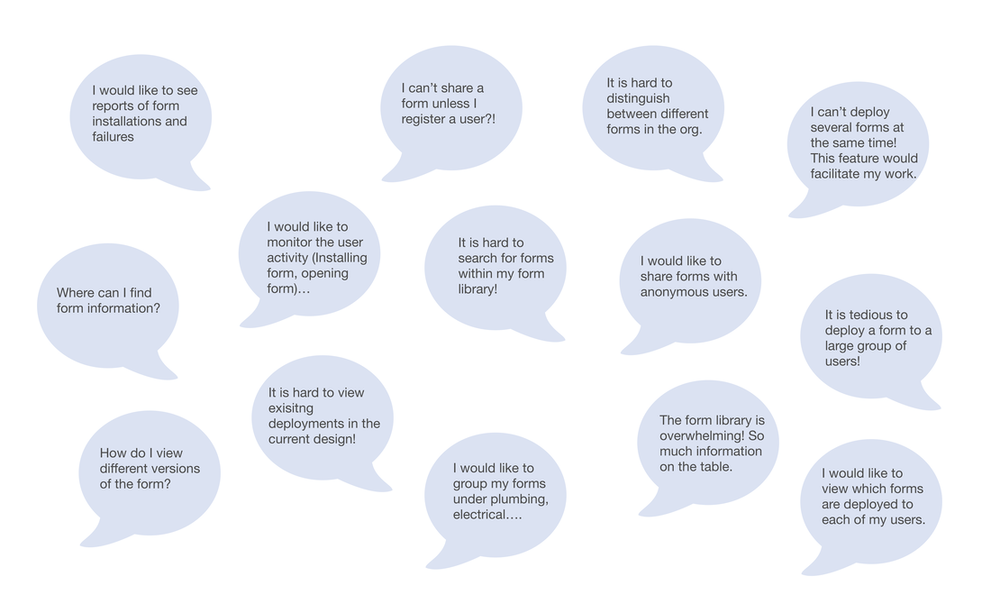
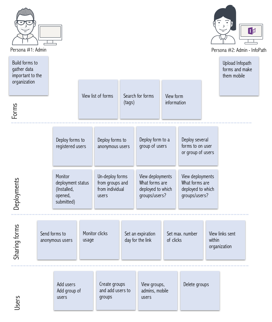
Understanding users tasks and stories helped us translate them into features that we can include in the product.
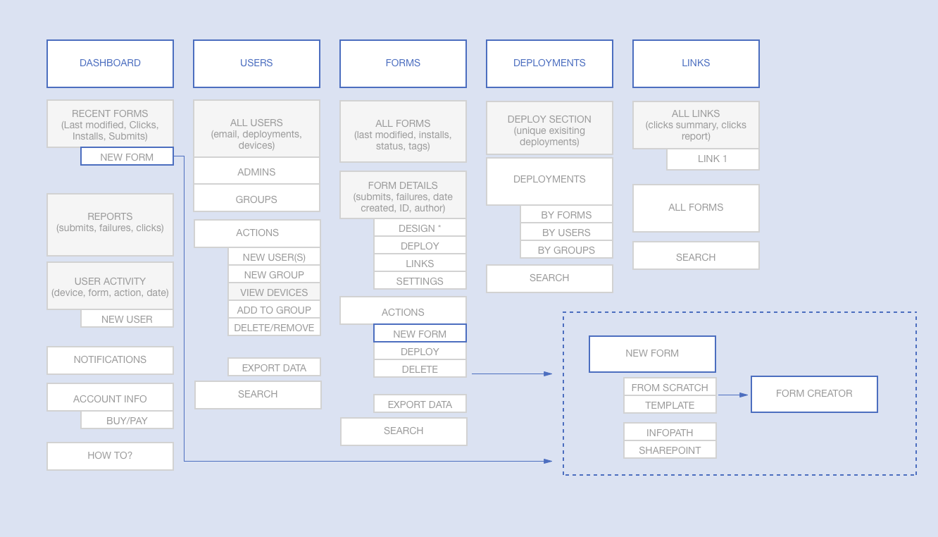
We laid out the different pages in the management portal and what each page needs to include to cater for the users and help them accomplish their tasks.
We laid out the different pages in the management portal and what each page needs to include to cater for the users and help them accomplish their tasks.
WIREFRAMES
|
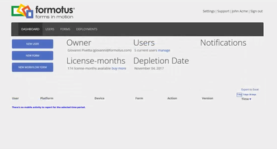
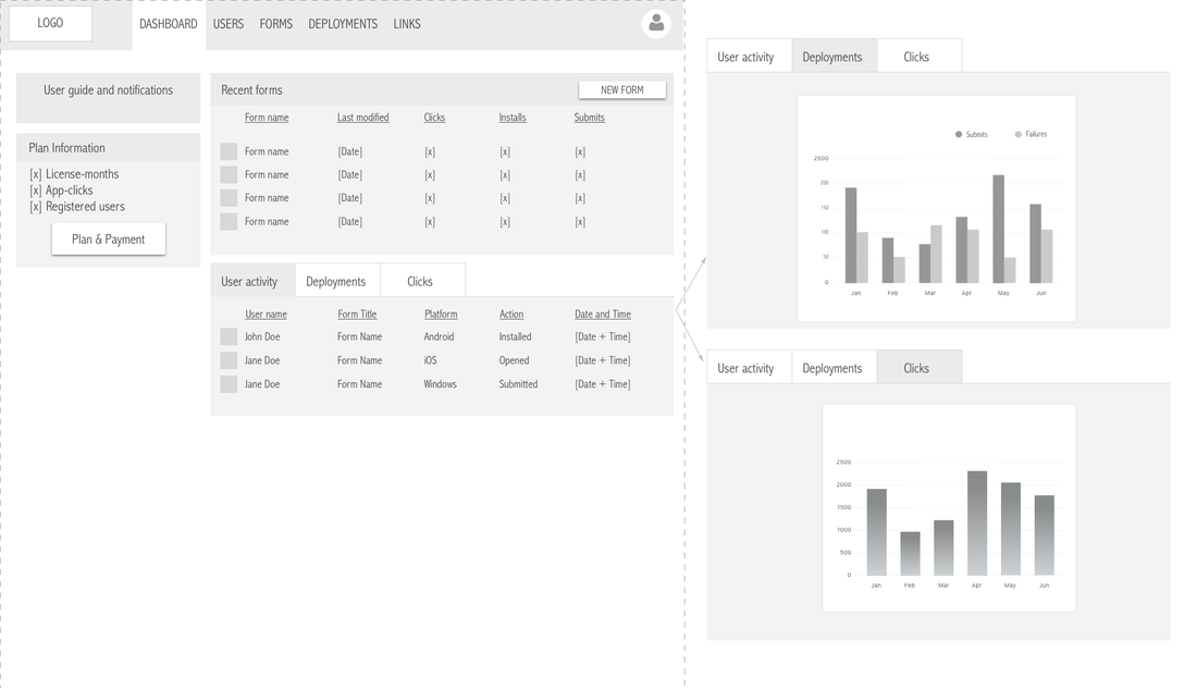
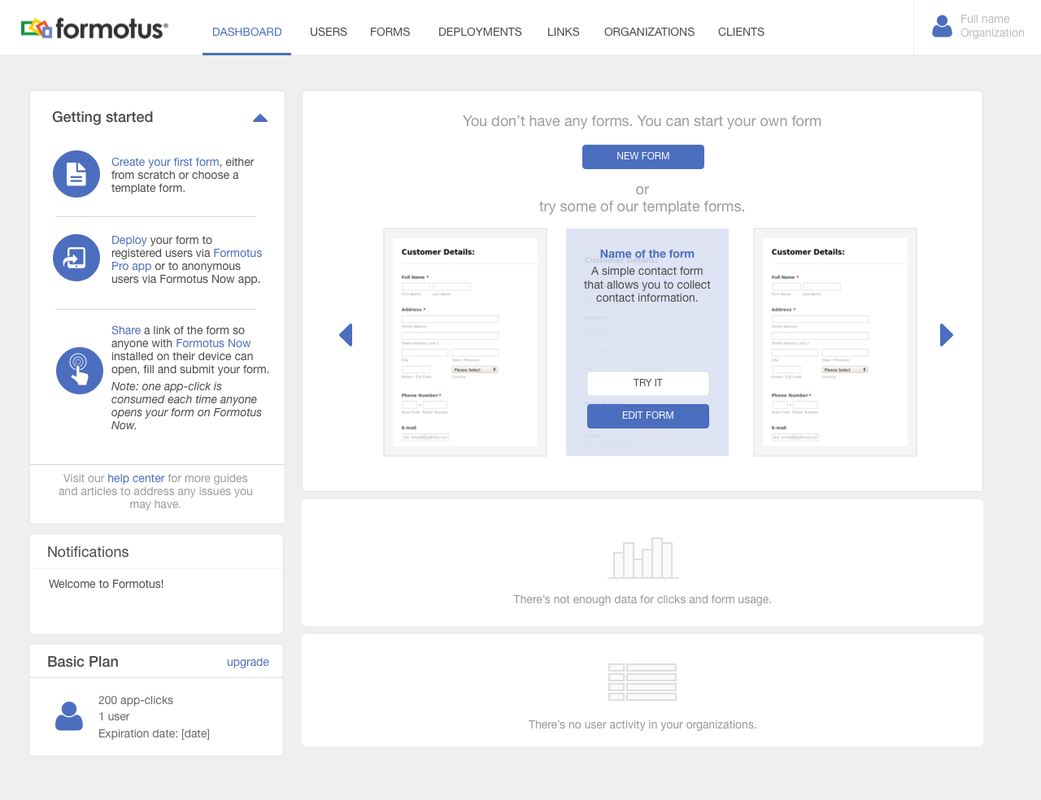
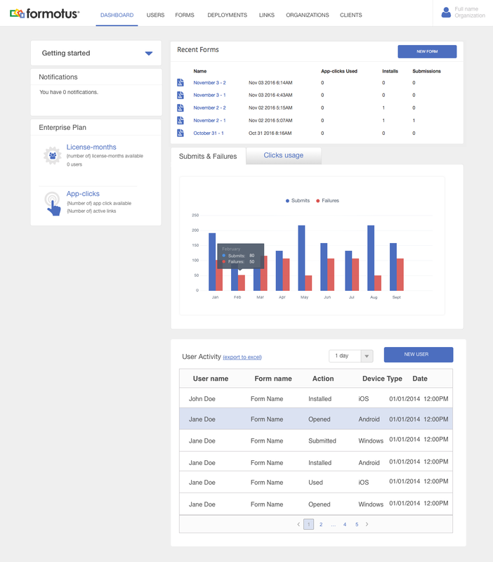
Dashboard
Challenges: What are the most important information to surface on this page when the user logs in?
|
|
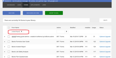
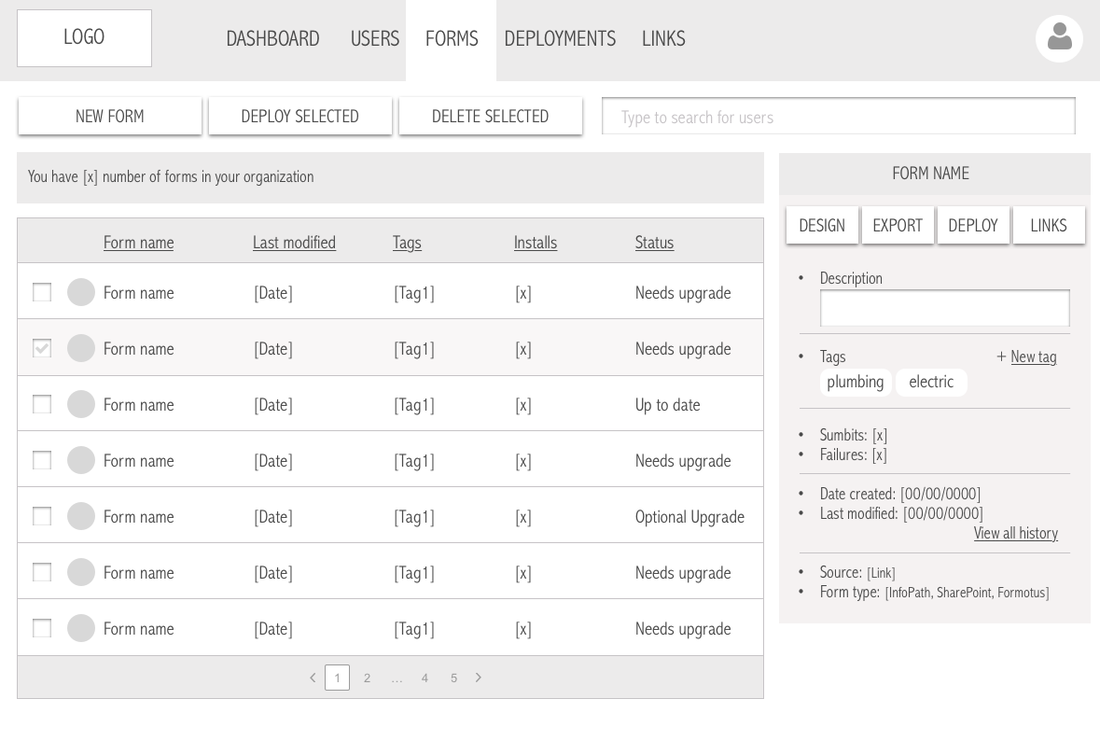
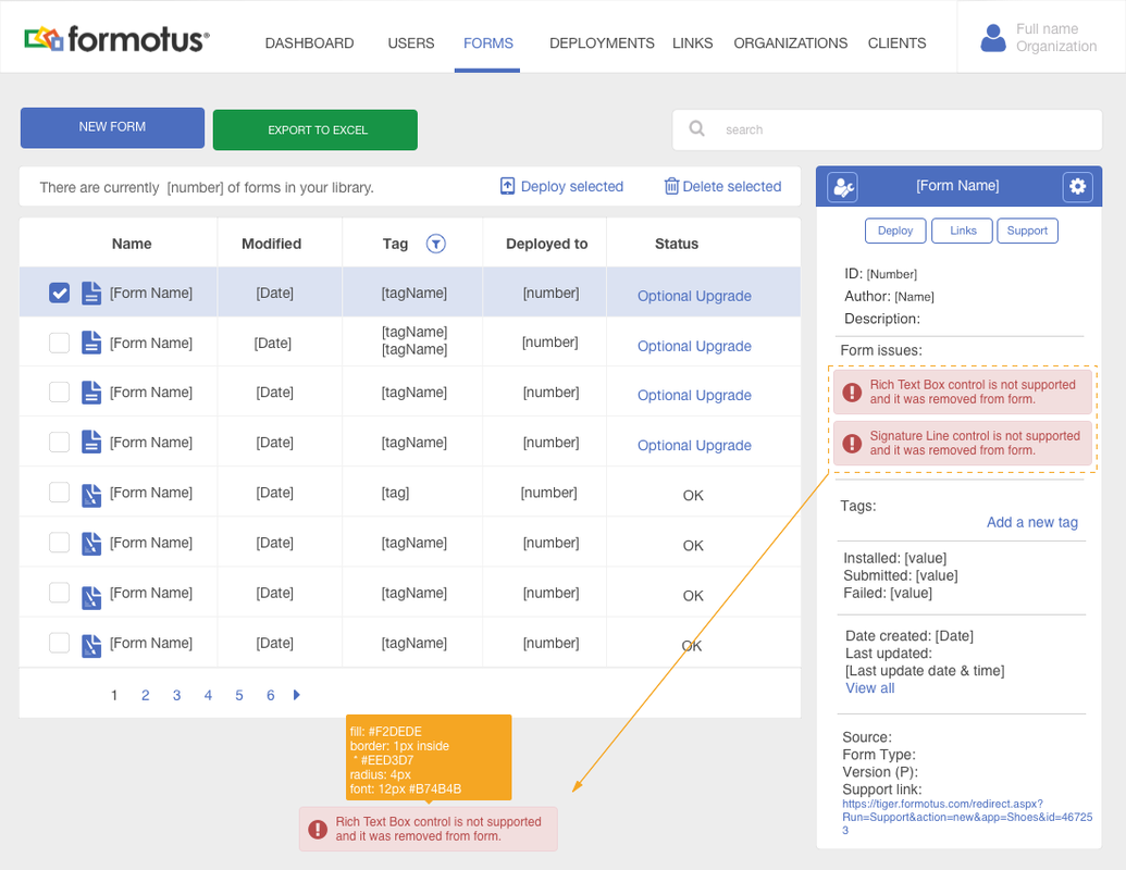
Forms page
Challenges: How to navigate and show all the information related to each from? How to find forms if library contains hundreds of forms?
|
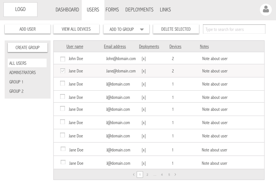
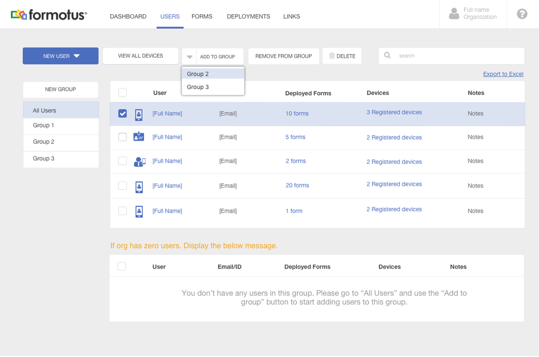
Users page
|
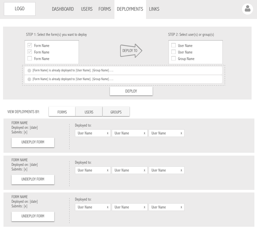
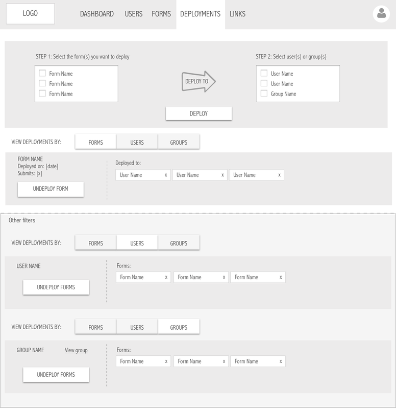
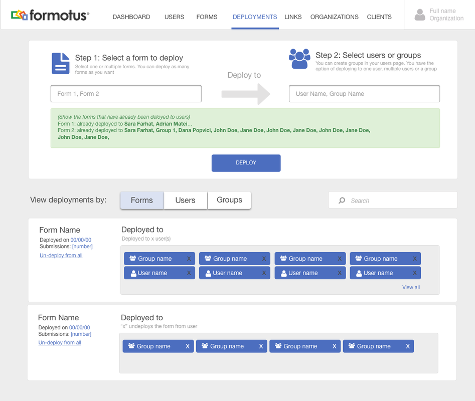
Deployments page
Challenges:
How to deploy x forms to x users?
Informing user of existing deployments
Challenges:
How to deploy x forms to x users?
Informing user of existing deployments
- Enhancing the deployment process to allow the user to deploy one or several forms to one user or a group of users
- General view of all deployments within the organization allowed the user to navigate their different deployments and take necessary actions
|
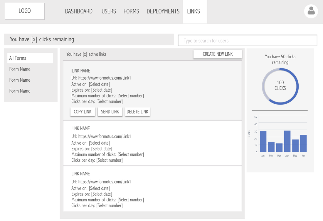
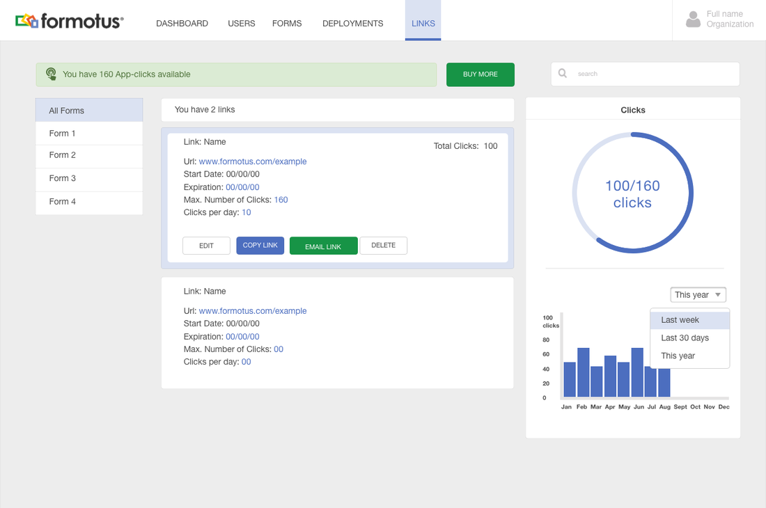
Sharing forms with anonymous users:
|
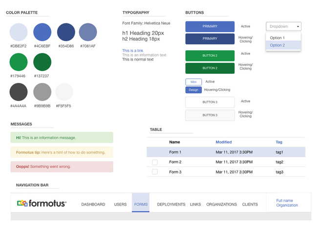
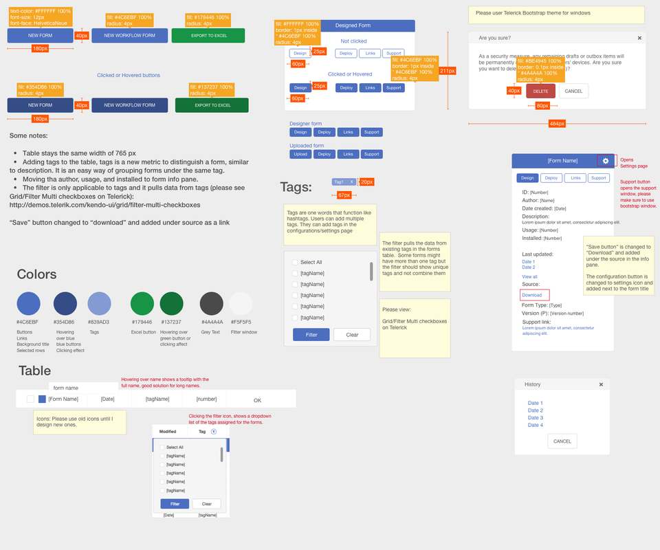
STYLE & DESIGN LIBRARY
Creating a style library was extremely essential to create a common grounds between my work and the developers work. It also helped us establish an identity for Formotus. I sat down with the team to define what our color palette should look like and what kind of emotions we wanted to trigger in the users, blue was chosen as the main color because it helped achieve a sense of trust and security. This was something we definitely wanted to convey to our users given that they were using Formotus to collect sensitive data.
I wanted the design to be intuitive and simple because there was a lot of information that we were surfacing to the user on every page.
So I went with a flat design and focused on using simple visual elements, typography and colors.
We used Bootstrap and Telerik UI to implement the design.
I wanted the design to be intuitive and simple because there was a lot of information that we were surfacing to the user on every page.
So I went with a flat design and focused on using simple visual elements, typography and colors.
We used Bootstrap and Telerik UI to implement the design.
FINAL DESIGN
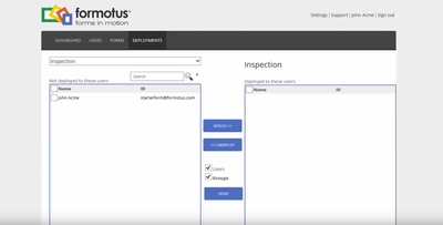
DASHBOARD DESIGN: The dashboard page was the first page the user accessed when login-ing in and so it was important to show them an overview of the organization. It was also important for on-boarding new users. So the experience was updated to help first time users navigate the product:
|
|
REFLECTING ON THE NEW DESIGN
Measuring success (Google's HEART Framework)
What we learnt
- Happiness: After launching the new management console, we sent out a survey to gather feedback from users on the new design. Most of the feedback was positive.
- Engagement: We tracked the usage of the new features we introduced on the platform along with existing revamped features and we saw an increase of usage.
- Adoption: After launching the new management console our users increase by 20%
- Retention: Existing users were using the different features we introduced
- Task success: We conducted several usability tests to measure how successful users were in accomplishing different tasks
What we learnt
- Surfacing too much information can confuse the user and create a chaotic experience, so one of the things that helped mitigate that was constantly asking the question of "What is important to display in the UI of each page? and Why was it important?'
- Because of the amount of changes we needed to introduce to the management console, I found myself falling in the trap of focusing on delivering and less on the what the experience looked like. One of the things that I did to mitigate that was keep a backlog of the all the design experiences that I wanted to come back to and iterate on.
- Sometimes the highest paid customer's opinion matters but to an extent. Focusing on some user's requests can be tricky, it is important to understand how the features they are asking for affects the experience of all users and it is very important not to fall in the trap of focusing on only their needs.
DESIGNING THE FORM CREATOR
WHAT ARE THE MOST COMMON FEATURES USED IN CUSTOMER FORMS?
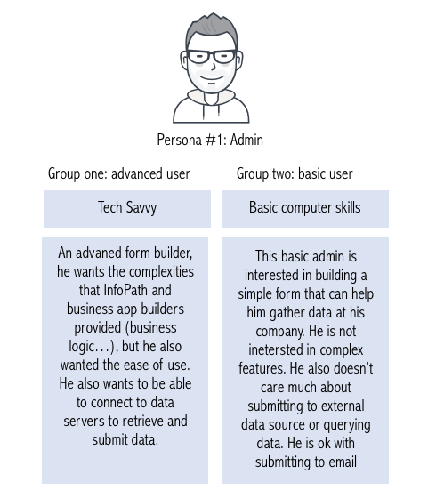
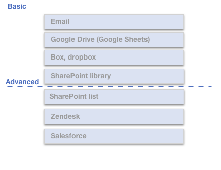
We interviewed several potential customers and looked at some of the forms they were already using and from there we were able to get an idea of what features the basic vs advanced users were using and what features they were comfortable with. This helped us understand what are we designing for which persona.
USER TASKS AND STORIES
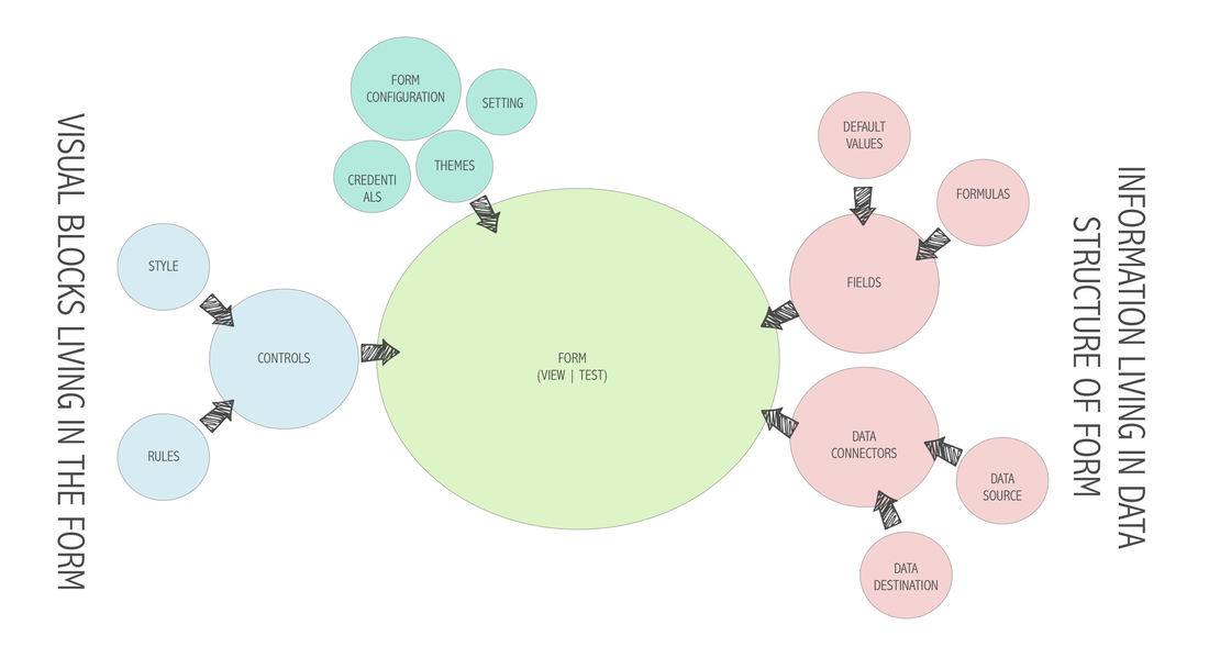
Based on user feedback (surveys/affinity diagrams) and researching similar products in the market, we were able to group the different tasks that are involved in the form creation into 4 major group:
- CONTROLS SECTION
- FORM CONFIGURATION
- FORM VIEWING|TESTING
- DATA AND FIELDS
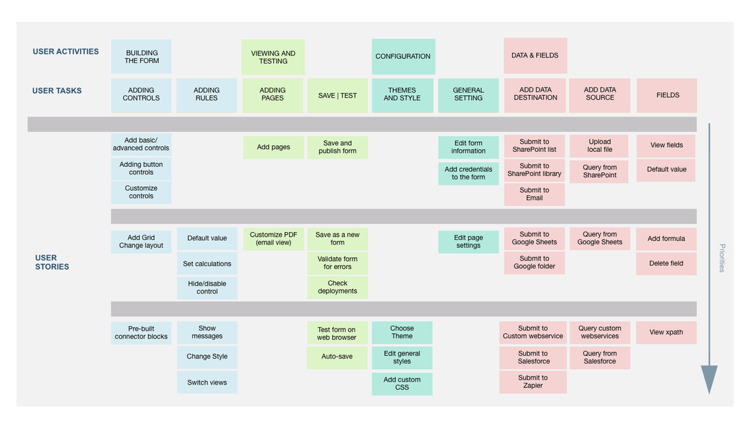
After grouping the four major blocks we started to lay out the different tasks the user will accomplish under each block.
This was accomplished through affinity diagram exercises with the team and some existing customers:
This was accomplished through affinity diagram exercises with the team and some existing customers:
ORGANIZATION AND HIERARCHY
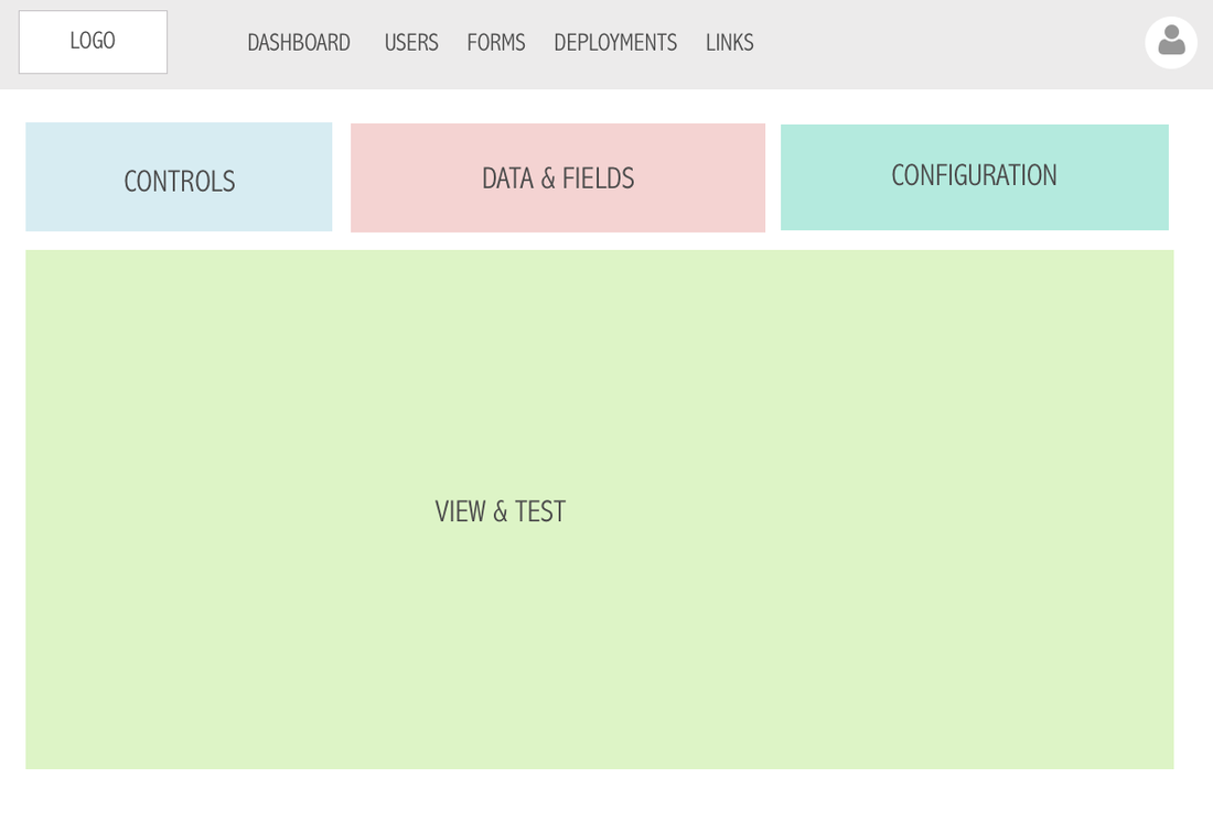
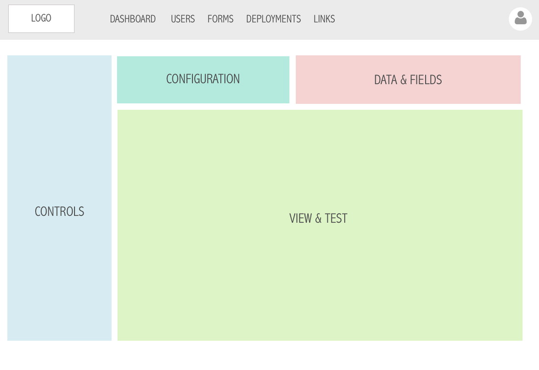
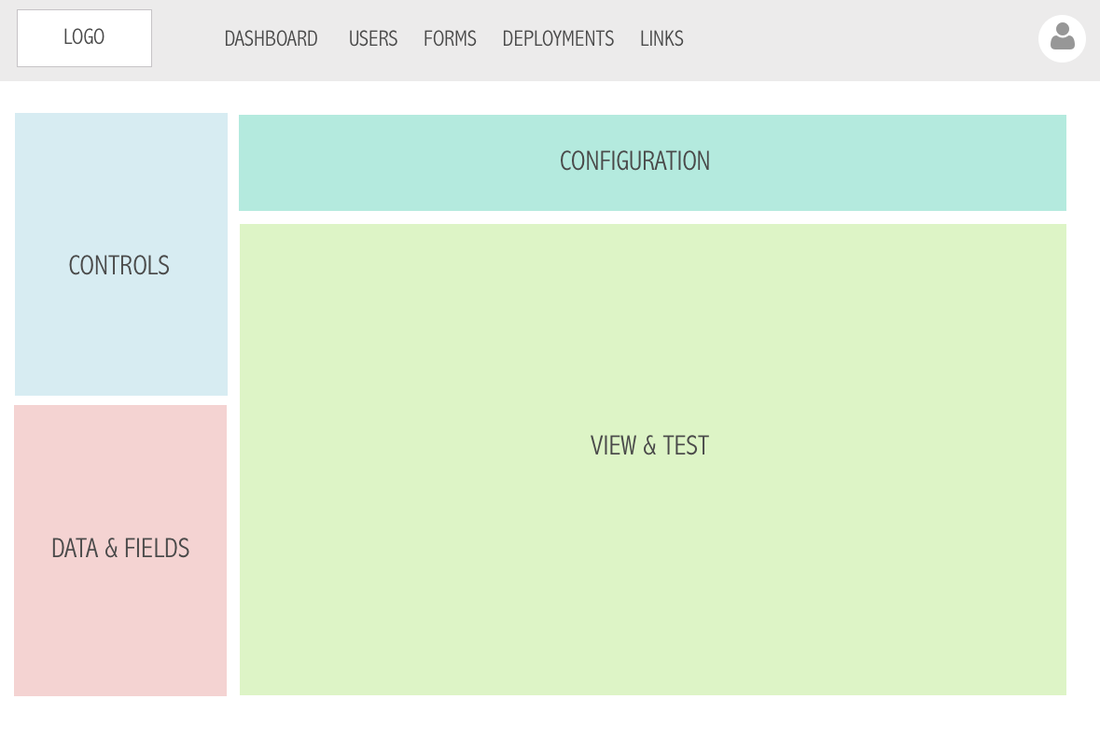
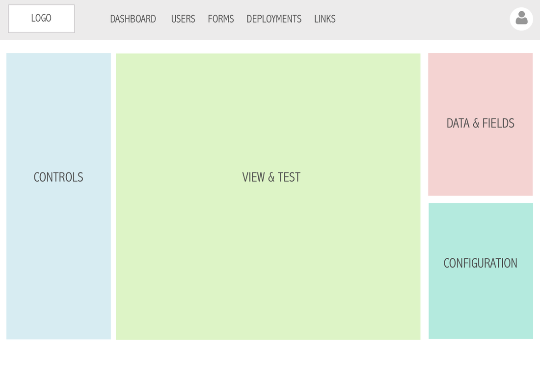
Getting the right layout was important, since there were a lot of elements that come into the process of creating a form, it was important to have the right layout that can help the user achieve that. There was no right or wrong layout here but we wanted to create an experience that is intuitive and friendly to use. Testing each layout with different members of the team helped us land the right one.
|
This layout has the largest space for form viewing but most of the form building involved the controls section, having that little real-estate for it meant we might have to reply on pop ups and separate windows to add controls, which was not ideal.
This layout paved the way for the ideal layout. The controls had a section that allowed us to include most of the features but the data and configuration section was too small for all the information that needed to be included.
|
It made sense to increase the sections that the controls|fields covered but we knew that the controls section would have to include a lot of customizable properties and some users won't necessary be customizing data and fields.
This was the winning layout because it created the perfect hierarchy between the different elements.
|
WIREFRAMING & PROTOTYPING
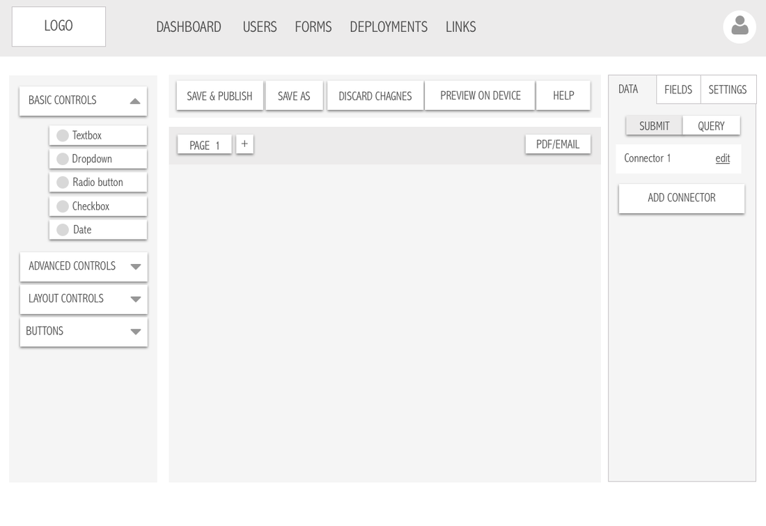
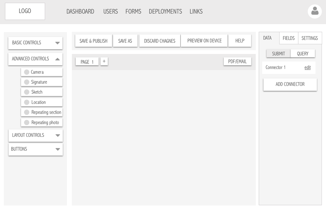
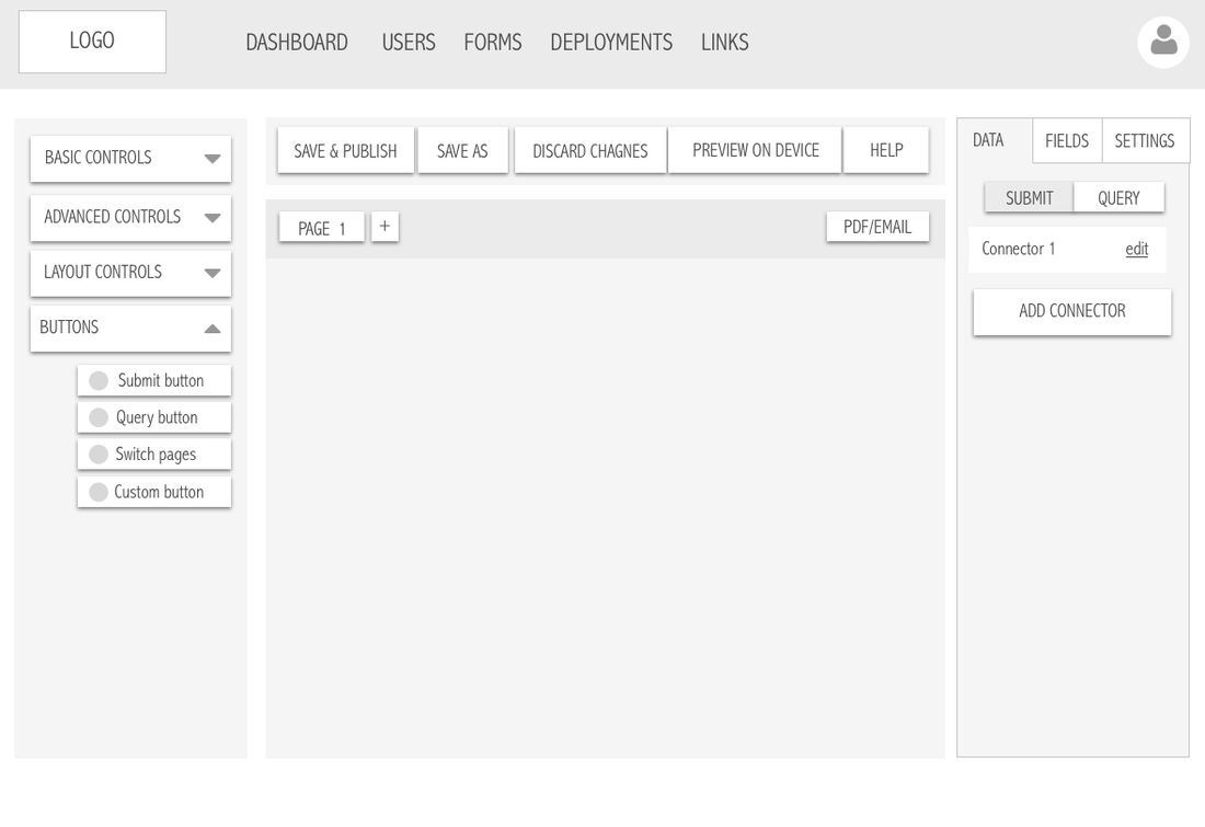
Controls Panel
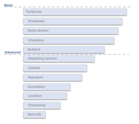
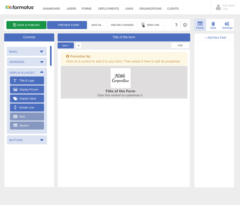
The controls panel contained the controls that the user can add to the form. We included basic controls that were useful for designing simple on the go forms and advanced controls that offered the users advanced features of collecting data.
|
|
|
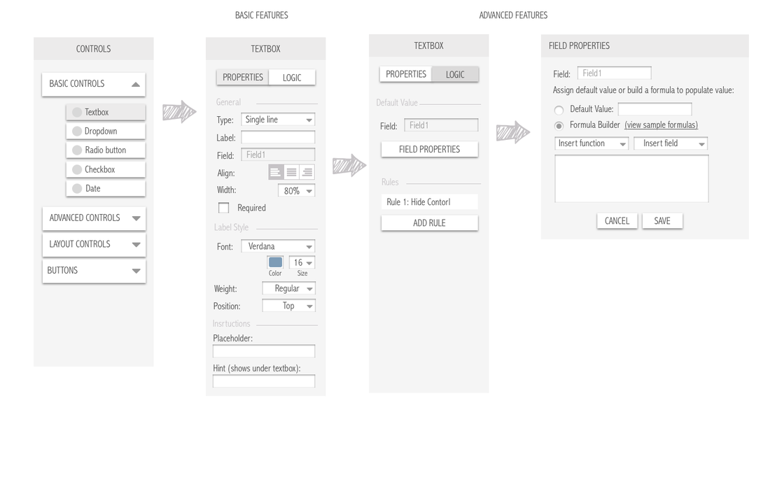
Challenges: How to cater for both basic and advanced users?
Some elements in the creator had advanced features that users with more experience can take advantage of. It was important for us to include these complex features without intimidating the basic user. The below control panel shows how we solved for that:
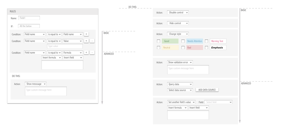
Designing for complex features: adding rules
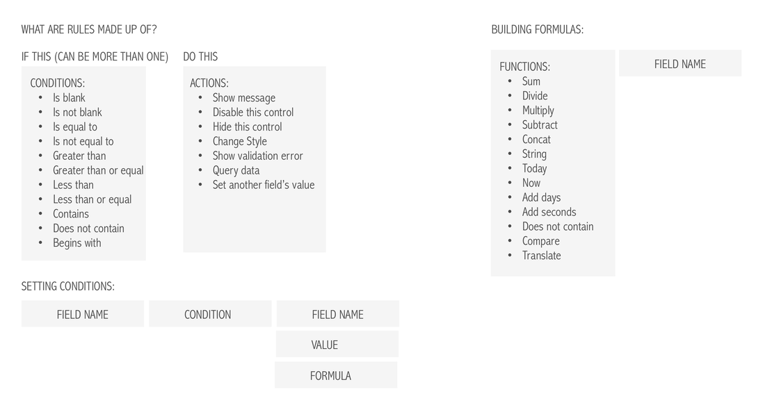
Rules help users perform certain actions on their form based on user input. This makes the forms more dynamic.
Both Basic and advanced users were using some form of rules when building forms, based on our research we laid out the most important components to include in this feature:
Both Basic and advanced users were using some form of rules when building forms, based on our research we laid out the most important components to include in this feature:
HIGH FIDELITY PROTOTYPES
BUILDING A FORM: DESIGNING FOR SEVERAL SCENARIOS
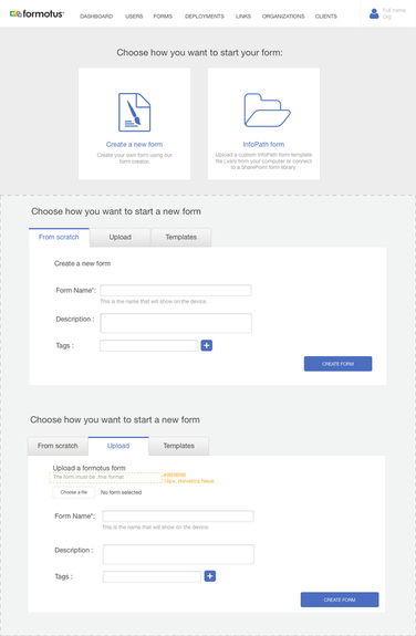
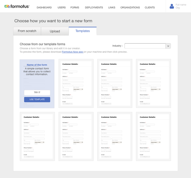
Thinking of the different user scenarios for building a form helped us achieve the right starting point for our different user personas:
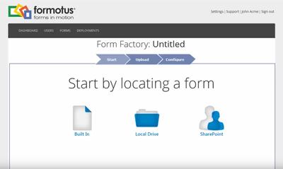
Create a new form:
Thinking of the different user scenarios for building a form helped us achieve the right starting point for our different user personas:
Create a new form:
- From scratch (basic + advanced)
- Upload an existing form (basic + advanced)
- Choose from a template (basic)
- Upload existing form (basic + advanced)
- Upload from sharePoint (advanced)
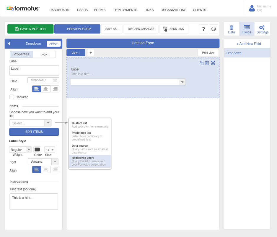
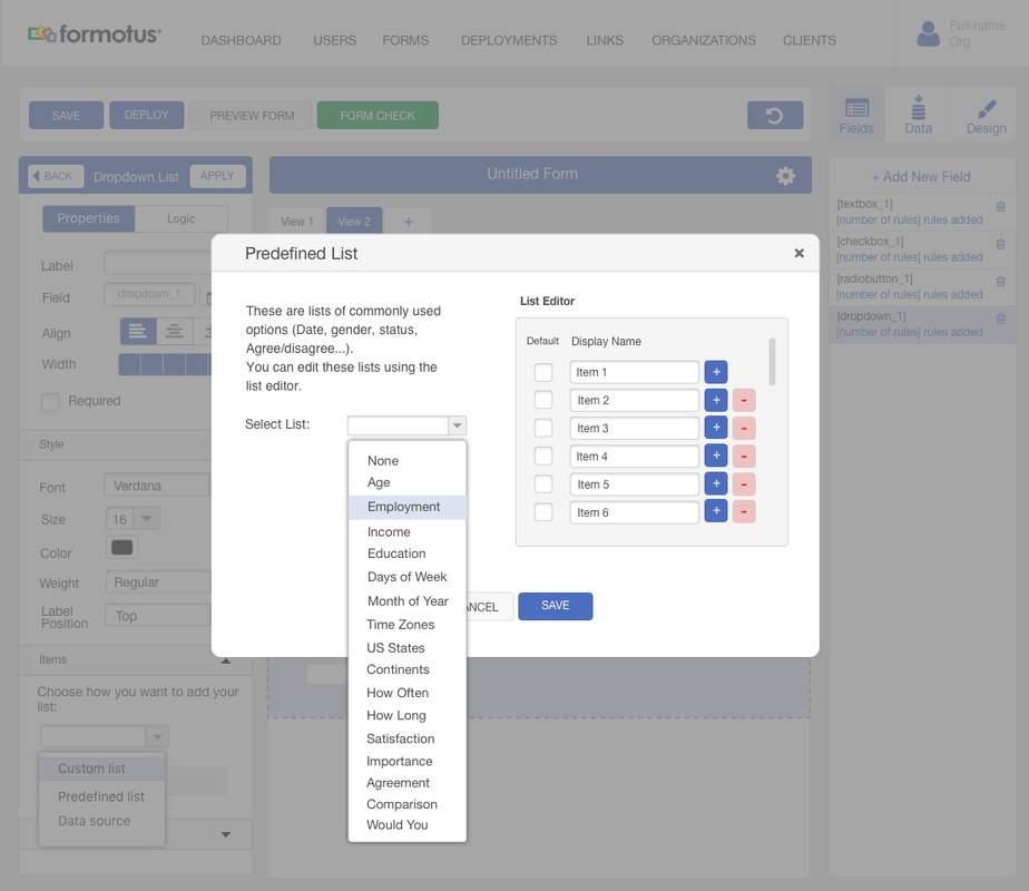
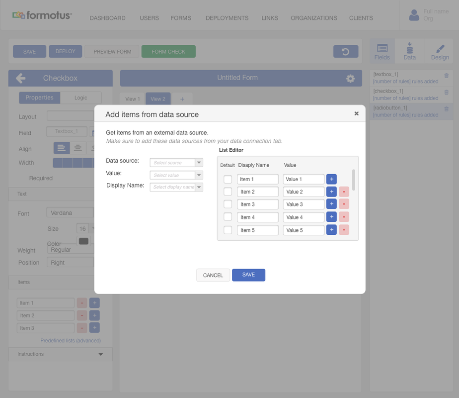
DROPDOWN LIST: EASING THE EXPERIENCE AND ALLOWING FOR MORE ADVANCED CAPABILITIES
This control allowed the admin to add lists inside the form. These lists can be generated from a data source, from predefined lists, custom lists.
This control allowed the admin to add lists inside the form. These lists can be generated from a data source, from predefined lists, custom lists.
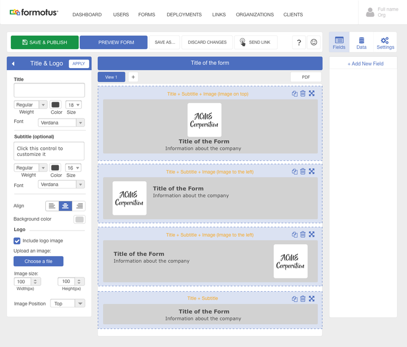
TITLE & LOGO: LEARNING FROM THE USERS
Assumption: We added several controls to the creator and we assumed that all these controls will give the users the flexibility to design their forms the way they want.
Problem: One of the features we discovered that the users needed after usability testing was the "Title & Logo" control. It was tedious work to have to add the title and logo using several separate controls and so we introduced "block controls": A pre-packaged set of controls under one control. One of these controls was the Title & Logo. This control was automatically generated on each page once added to the form - with the option to delete it.
BLOCK CONTROLS: TURNING COMPLEX FEATURES INTO FRIENDLY FEATURES
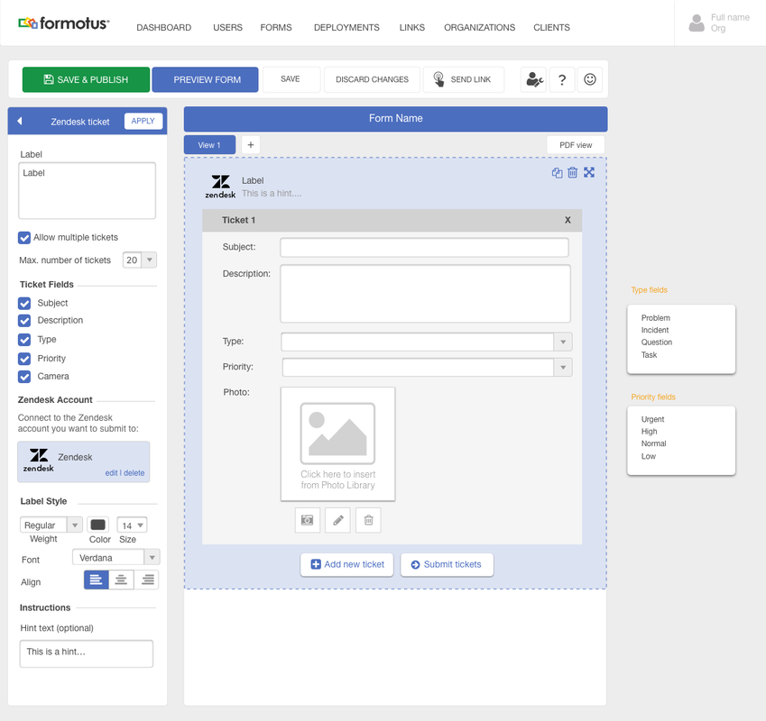
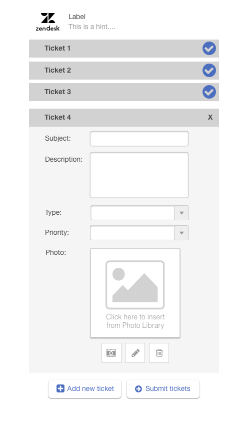
Some customers found it complicated to add connectors and build forms to submit data to them. This scenario was mostly faced with Zendesk and Salesforce connectors. To solve this problem we introduced block controls. These were basically pre-built controls that allowed the admins to easily generate template forms to submit data to Zendesk or Salesforce.
Some customers found it complicated to add connectors and build forms to submit data to them. This scenario was mostly faced with Zendesk and Salesforce connectors. To solve this problem we introduced block controls. These were basically pre-built controls that allowed the admins to easily generate template forms to submit data to Zendesk or Salesforce.
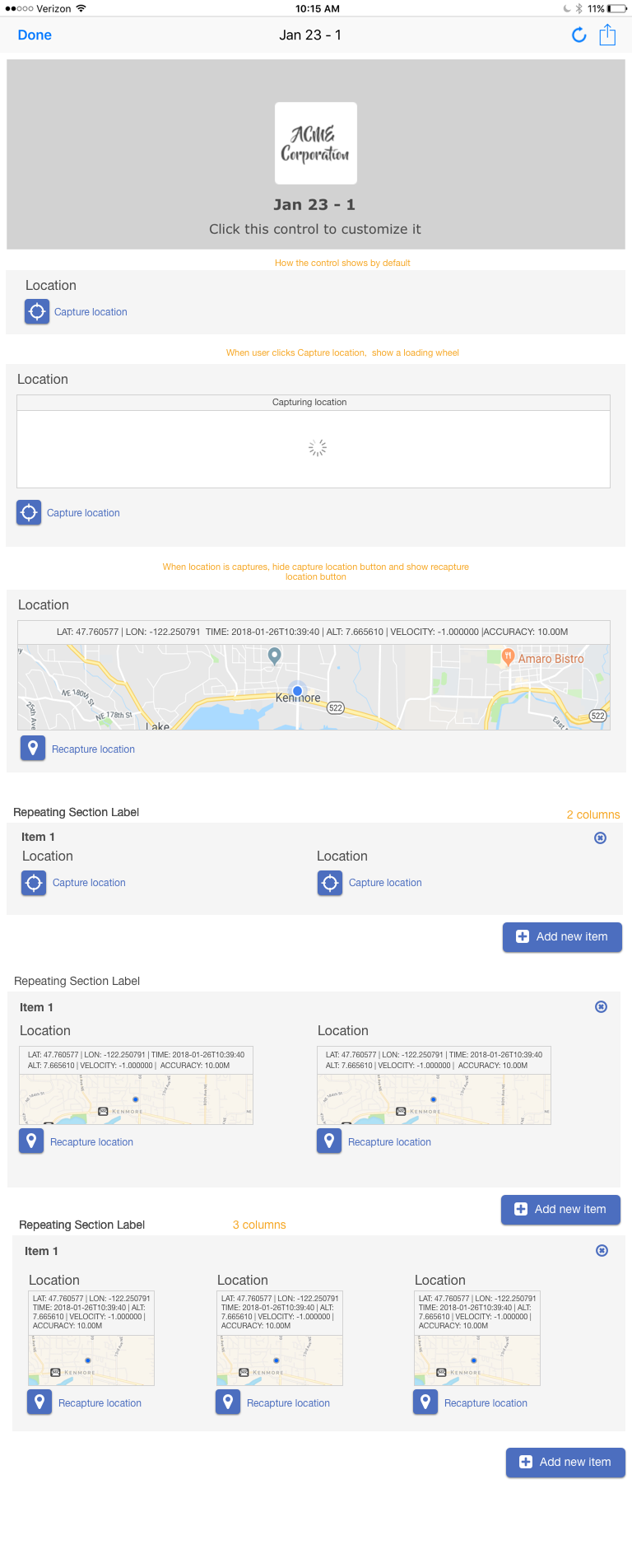
RESPONSIVE DESIGN: HOW TO TACKLE PROBLEMS OF LAYOUT
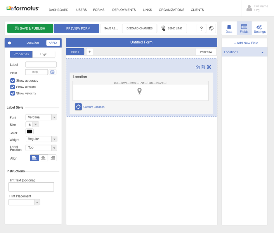
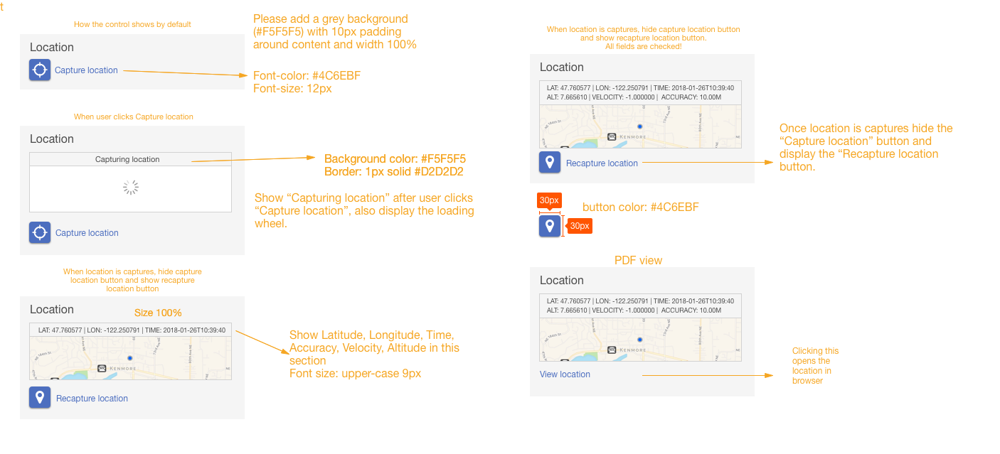
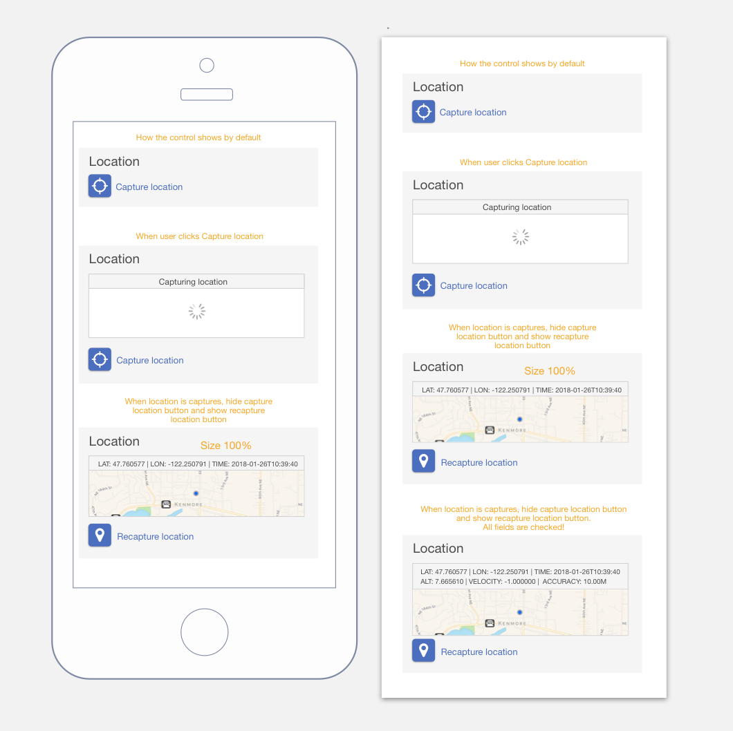
Location control was of that our customers wanted to include in their forms. This control was added to the form and allowed the person filling the form to tag their location.
Location control was of that our customers wanted to include in their forms. This control was added to the form and allowed the person filling the form to tag their location.
REFLECTION ON THE FINAL DESIGN
Measuring success (Google's HEART Framework)
What I learnt
- Happiness: We included a feedback button :) in the form creator to gather feedback from users about their experience and we can improve
- Engagement: We tracked the usage of different features within the creator to see what were the most popular and how we can improve on the other features that were not getting as much engagement. An example of that was with the data connectors, most customers were submitting their forms to email, we decided to create a series of feature documentation (sent via email) to educate them about other connectors such as Google drive and SharePoint.
- Adoption: We were seeing an increase in customers using the creator month after month (Around 40% new users every month)
- Retention: 20% of existing businesses made the switch from InfoPath forms to our own native forms.
- Task success: We conducted several usability tests to measure how successful users were in accomplishing different tasks within the creator and this exercises was very beneficial to help improve on our product.
What I learnt
- It is very important to keep a backlog of all the things you want to improve on. Because of the complexity of the form creator there were a lot of features that we needed to improve on but the ones that made it were the ones that were high priority. Keeping a backlog of all the bugs and features that I needed to work on was very useful especially during times when we weren't shipping major features. I would return to this list and try to accomplish as much as I can from it.
- Importance of working with developers early on in the process. Because of the technical limitations that we had due to the framework we were using it was important for me to include the developers early on in the design process and see what are some of the options that I had for designing certain features, this saved me a lot of time.
- keep it simple and don't over design your product.

